
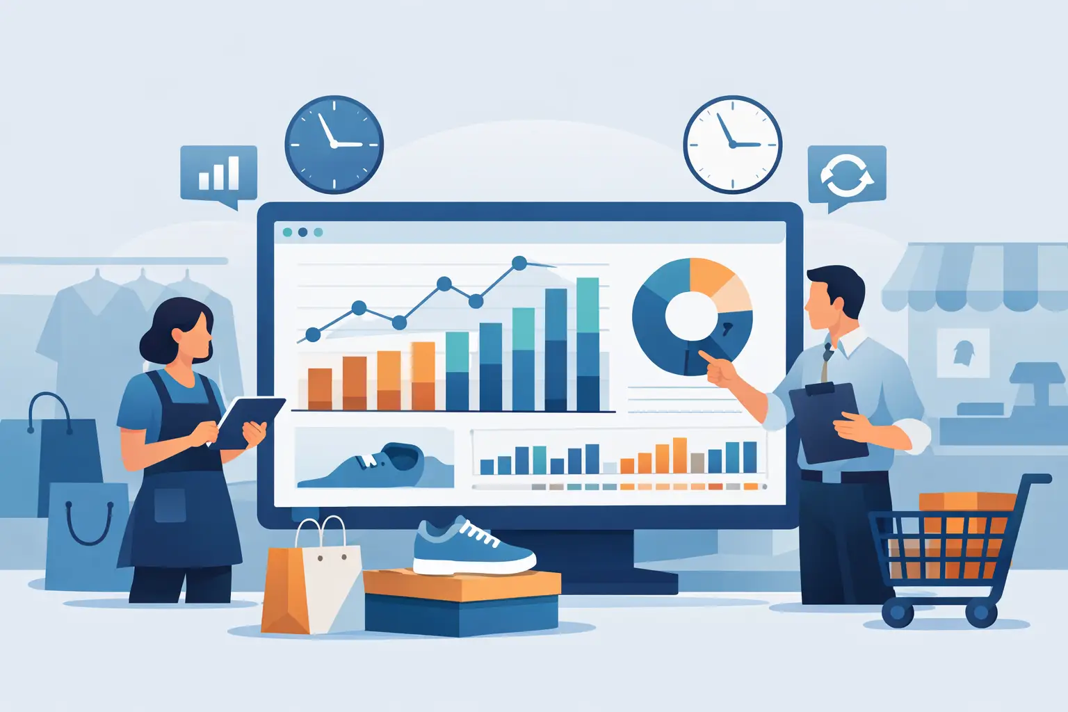
The 2:00 p.m. sales dip means one thing in one store and something completely different in another. It might be a staffing issue, a broken promotion, a weather pattern, or simply the normal rhythm of that location. Without an hourly sales dashboard retail operators can trust, those differences get buried inside daily totals, and the wrong decisions follow.
For store managers and multi-location operators, hourly visibility is not a nice extra. It is how you spot missed revenue windows, labor mismatches, and branch-level performance shifts before they become weekly problems. Daily sales reports tell you what happened. Hourly reporting gets much closer to why it happened.
What an hourly sales dashboard retail teams actually need
A useful hourly sales dashboard is not just a chart with bars by hour. It needs to show sales patterns in a way that helps someone act during the day, after close, and across multiple branches. That usually means seeing net sales by hour, transaction count, average basket size, units sold, and ideally payment mix or category contribution if those affect trading patterns.
Context matters just as much as the metric itself. A 10:00 a.m. spike is not especially useful if you cannot compare it against yesterday, last week, the same store’s usual pattern, or nearby branches. Retail operators need to know whether a sales curve is healthy, slipping, or unusual. They also need to know if the issue is local to one branch or repeated across the business.
This is where many reporting setups fall short. POS systems can export hourly transaction data, but the output often lands in spreadsheets that require manual cleanup, merging, and formatting before anyone can analyze it. By the time the file is ready, the insight is late.
Why hourly sales matters more than daily totals
Daily totals are useful for finance and end-of-day control. They are less useful for running stores in real time. Two branches can both finish at $8,000 in sales, yet one may have traded steadily while the other had a strong morning and then collapsed after lunch. The operational response should not be the same.
Hourly reporting helps answer questions daily totals cannot. Are peak hours shifting? Are promotions driving traffic at the intended times? Is staffing aligned with customer demand? Are certain stores overly dependent on a narrow trading window? If a branch misses its target, the hourly pattern often points to the cause faster than a weekly report ever will.
There is also a margin angle. If the busy window is short and checkout speed is poor, you lose sales despite healthy demand. If labor is concentrated in dead hours, payroll efficiency suffers even when revenue looks acceptable on paper. An hourly view exposes those gaps.
The signals to watch in an hourly sales dashboard retail view
The best dashboard surfaces a few core signals clearly instead of overwhelming managers with every available metric. Hourly net sales is the obvious starting point, but transaction count often explains more. If sales are flat but transactions are down, average basket may be masking weaker traffic. If transactions are healthy but sales lag, basket size or product mix may be the issue.
Average transaction value is especially useful in convenience, grocery, pharmacy, and general retail formats where traffic patterns can stay stable while customer spending changes. Units per transaction helps add another layer. A promotion may lift transaction count but lower basket quality, which can matter if margin is already under pressure.
Comparisons are essential. Store operators usually need same-day last week, daypart trends, branch ranking by hour, and sometimes department or category performance by hour. A dashboard should make those views easy to read without requiring someone to build a custom report each time.
Common use cases by store type
A convenience store operator may use hourly sales data to understand commuter traffic and late-night demand. A pharmacy may care more about prescription-linked peaks, front-of-store conversion, and whether staffing matches the rush after clinic hours. A mini mart may look closely at weekend evening patterns, while a grocery chain may focus on lunch, after-work, and promotional spikes.
The point is not that every retailer needs the same hourly dashboard. It is that every retailer benefits from having one built around actual operating decisions. If the dashboard does not support scheduling, replenishment timing, promotional review, or branch comparison, it becomes another report people stop opening.
What good dashboard design looks like in practice
The most effective hourly dashboard retail setup is simple on the surface and flexible underneath. Managers should be able to open it and quickly see where sales peaked, where a dip started, and which branch is behaving differently. Regional leaders should be able to compare multiple stores without rebuilding filters in spreadsheets.
That means clear time-series visuals, branch filters, date comparisons, and drill-down options that connect hourly patterns to products, departments, or payment types. It also means consistent data structure. If one store exports files differently from another, trust in the dashboard breaks down fast.
There is always a trade-off between detail and usability. A highly detailed dashboard may satisfy analysts but slow down operators. A lightweight dashboard may be easier to use but miss important drivers. The right balance depends on who uses it most often. For many retail businesses, the answer is a dashboard that starts with core KPIs and allows deeper analysis only when a pattern needs investigation.
Why exported POS data often creates reporting delays
Many retail teams already have the raw data they need. The problem is not access to data. It is turning exported files into something reliable and readable without spending hours in manual prep.
Hourly sales exports often arrive as CSV or XLSX files with inconsistent date formats, branch naming issues, duplicated records, or mismatched product structures. Someone then has to validate the files, standardize them, combine them, and build the visuals. For a growing retail business, that process is hard to maintain across multiple stores.
This is where a retail-specific analytics workflow makes a practical difference. Instead of treating hourly sales as a custom BI project, the process should validate uploaded POS files and convert them into prebuilt dashboards designed for store operations. That shortens the path from export to action.
Turning hourly dashboards into decisions
The real value of an hourly dashboard is not the chart itself. It is the speed at which it helps teams decide what to do next.
If one branch consistently underperforms between 12:00 p.m. and 2:00 p.m., you can check labor coverage, queue times, local competition, and category availability during that period. If several stores show a late-evening lift after a promotion starts, you can extend stock allocation or adjust staffing. If card usage spikes during busy periods while cash sales remain steady, you may identify payment behavior that affects speed at checkout or average basket value.
This is also where natural-language analysis becomes useful. Instead of manually slicing the data, a manager should be able to ask which branches lost sales after 6:00 p.m., which hours had the highest average basket last Saturday, or whether a promotion changed traffic patterns in a specific store cluster. That makes hourly reporting more usable for non-technical operators, not just analysts.
BusinessMetrics AI is built around that idea: uploaded retail data should become dashboards and practical AI answers quickly, without forcing operators into a long reporting setup.
How to evaluate an hourly sales dashboard retail solution
If you are choosing a dashboard approach, start with operational fit. Can it handle the exported POS files you already have? Can it validate them before bad data reaches the report? Can branch managers, commercial leaders, and finance teams all use the same source of truth without asking for custom builds every week?
Then look at speed. If dashboard creation depends on analysts or external consultants, it may not keep up with store operations. Retail teams need a process that works repeatedly as new files arrive and new branches come online.
Finally, look at how easily the dashboard connects hourly performance to broader retail questions. A sales dip by hour is useful. Knowing which categories, stores, customers, or promotions sit behind that dip is what makes the dashboard operationally valuable.
An hourly sales dashboard should reduce guesswork, not add another layer of reporting overhead. When the dashboard is built around real retail workflows, hourly data stops being something you review after the fact and becomes part of how you run the business with more control every day.
The best time to look at hourly sales is before the next missed peak tells you what the report should have shown sooner.