
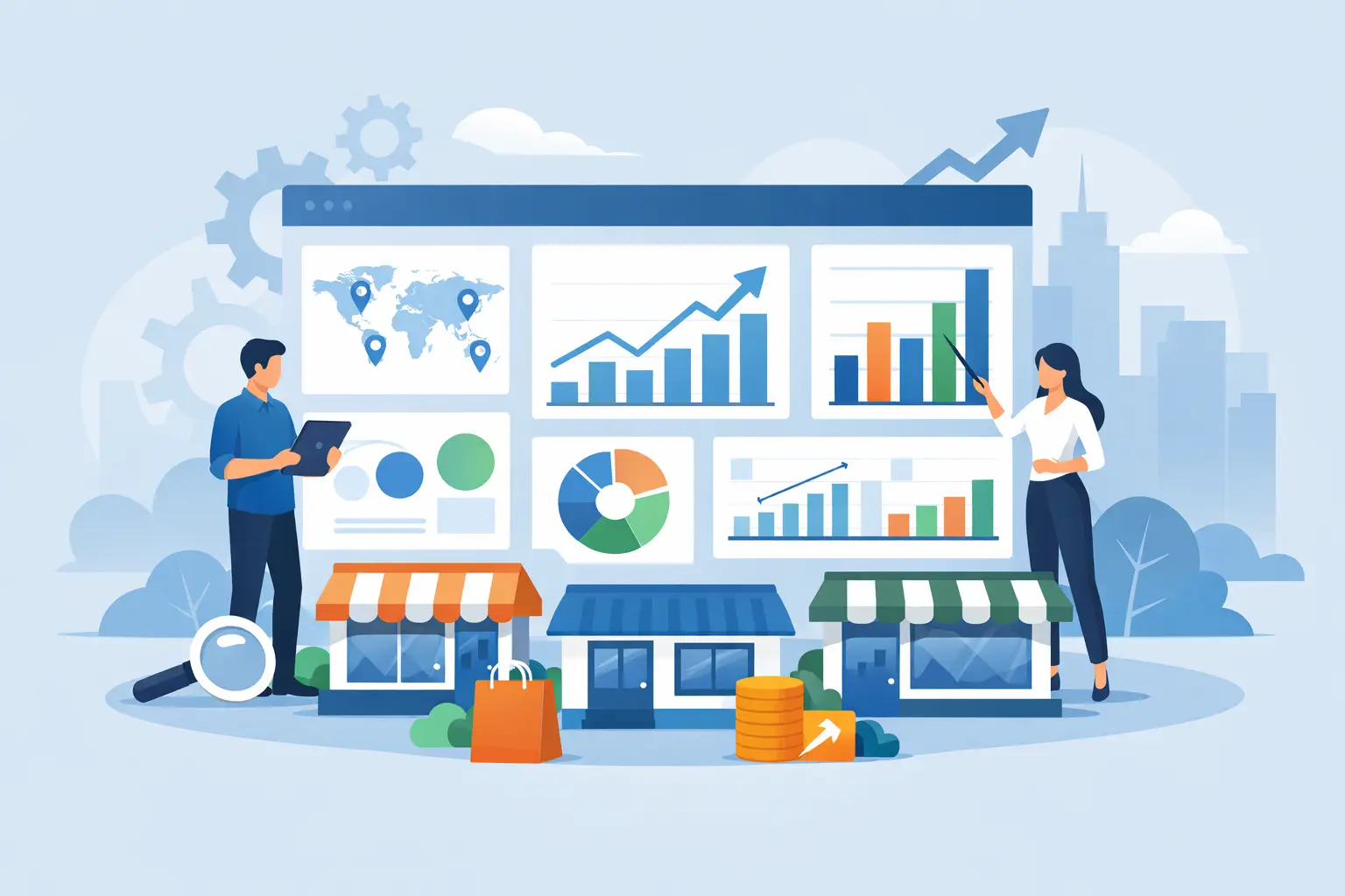
When one store misses target, you can usually spot it. When twelve stores drift in different directions at once, the problem is harder to see and much more expensive to ignore. A multi store sales dashboard gives operators one place to compare branch performance, identify outliers, and act before weak sales, margin loss, or stock issues spread across the business.
For multi-location retail, the real challenge is not collecting data. Most teams already have POS exports, inventory files, and promotional records. The challenge is turning those files into a view that helps a district manager, owner, or finance lead answer practical questions quickly. Which branches are slipping? Which categories are carrying the business? Are promotions driving profitable growth, or just moving low-margin volume? Where is stock availability hurting sales?
Why a multi store sales dashboard matters
A single-store report can hide patterns that only appear when locations are compared side by side. One branch may be growing because of traffic, another because basket size improved, and another may be flat because top-selling items were out of stock. If you only review each store in isolation, you miss the broader operating story.
A good dashboard creates a common operating view across the chain. It helps retail leaders measure performance consistently, not through different spreadsheets built by different people. That matters when decisions affect staffing, purchasing, promotions, pricing, and store-level accountability.
It also reduces reporting lag. Many multi-branch businesses still rely on someone exporting files, cleaning columns, building pivot tables, and sending static reports to the team. By the time leadership reviews the numbers, the week is already moving on. A dashboard shortens that cycle and makes store comparison part of routine operations rather than a monthly reporting project.
What a multi store sales dashboard should include
The strongest dashboards do not just stack revenue by store. They show branch performance in context, with enough detail to support action.
At the top level, sales by store is the starting point. You need current period sales, prior period comparison, growth rate, and contribution to total revenue. But revenue alone can mislead. A high-volume branch with heavy discounting or weak category mix may look healthy while eroding margin.
That is why gross profit, margin rate, and average transaction value matter alongside sales. If one branch is driving revenue through aggressive markdowns, the dashboard should make that visible. If another branch has modest traffic but stronger basket size and better mix, that should stand out too.
Product and category performance should sit close to store performance, not in a separate reporting silo. Operators need to see whether a branch is underperforming overall or just missing in key departments. A convenience operator, for example, may find that beverage sales are growing chain-wide while snacks lag in specific stores due to shelf allocation or stock issues. That is a much more useful finding than simply knowing store sales are down 3%.
Inventory-related signals are also essential. A store can miss plan because demand is weak, but it can also miss plan because top items were unavailable. A useful dashboard should connect sales trends with stock position, out-of-stock indicators, or at least low-availability patterns. Without that, store managers can be blamed for problems caused by replenishment gaps.
Promotional performance belongs in the same decision flow. If a campaign lifted unit sales but reduced margin and mostly shifted demand from full-price items, the dashboard should help you see that. The goal is not to report activity. It is to judge commercial effectiveness.
Store comparison is where value shows up
The reason retailers invest in a multi store sales dashboard is simple: comparison creates clarity. It becomes easier to see top performers, weak performers, and unusual exceptions.
Ranking stores by sales growth is useful, but it is rarely enough. A more operational comparison looks at growth, margin, average basket, units per transaction, category mix, and payment mix together. One branch may be strong on sales but weak on cash handling efficiency. Another may have healthy margin but poor traffic conversion. Those differences shape what action each store actually needs.
This is where dashboard design matters. Too many metrics create noise. Too few create false confidence. The best approach is to start with a clear store summary, then allow drill-down by branch, category, product, daypart, and promotion. That way leaders can move from broad oversight to root-cause analysis without rebuilding reports.
What retail teams should be able to answer fast
A dashboard is only useful if it shortens the path from question to action. For multi-branch retailers, the recurring questions are usually operational, not academic.
Teams should be able to identify which branches are below target this week, which locations lost margin despite higher sales, and which stores are overperforming due to a few categories rather than broad demand. They should be able to spot whether a promotion worked across all branches or only in selected store types. They should also be able to isolate fast-moving items, dead stock, declining departments, and unusual shifts in customer spend.
This is where conversational analysis becomes especially practical. Instead of asking an analyst to build another version of the report, a manager should be able to ask which branches had the biggest drop in average basket size, or which products drove growth in suburban stores last month. For operators who already have structured exports from POS and back-office systems, that kind of access removes a lot of delay from decision-making.
Common mistakes when building a multi store sales dashboard
The first mistake is treating every store as directly comparable. Stores vary by size, format, neighborhood, and product mix. Comparing a high-traffic urban store to a smaller suburban site without context can create bad decisions. A useful dashboard should support fair comparisons through normalized metrics, store grouping, or segment filters.
The second mistake is focusing on visual appeal over usability. Retail leaders do not need decorative charts. They need a clean layout that highlights movement, exceptions, and drill-down paths. If users need training just to find branch performance by category, the dashboard is too complex.
Another common issue is overreliance on static reporting. A PDF or weekly spreadsheet can tell you what happened, but it slows down follow-up questions. Once teams need a different store grouping, date range, or product view, the reporting cycle starts again. That is where self-service dashboards have an advantage, especially for growing chains without a full BI team.
Data quality is the final weak point. If store names are inconsistent, product hierarchies are messy, or exported files are missing fields, the dashboard becomes unreliable fast. Validation at the upload stage matters more than many teams expect. Bad inputs create false comparisons, and false comparisons create wasted action.
The best dashboard workflow starts with the data retailers already have
Most retailers do not need a long analytics implementation to get value. They need a practical workflow that accepts exported CSV or XLSX files from POS and operational systems, validates the data, and turns it into dashboards that reflect how stores are actually run.
That matters because adoption usually depends on speed. If onboarding takes months, teams go back to spreadsheets. If the system can take sales, product, inventory, customer, department, hourly, and promotion exports and turn them into ready-to-use views, the dashboard becomes part of daily management.
This is also where retail-specific design beats generic BI tools. A general platform may let you build almost anything, but many operators do not want to start with a blank canvas. They want prebuilt views for branch performance, product movement, customer value, payment mix, and promotional results. Then they want to ask follow-up questions without waiting on technical support.
BusinessMetrics AI is built around that practical use case. The goal is not to force retail teams into a heavy analytics project. It is to turn structured retail data uploads into dashboards and AI-assisted answers that help operators see which branches, products, customers, and categories need attention.
Choosing the right multi store sales dashboard
The right choice depends on how your business works. If you run a small number of stores with one standard format, you may only need branch comparisons, trend lines, and category views. If you operate across formats or regions, you will need stronger filtering, segmentation, and more careful benchmarking.
You should also look closely at how fast your team can get from exported data to usable reporting. If every update still depends on manual preparation, the dashboard may save presentation time but not analysis time. If users can load files, review validated data, and start asking useful questions the same day, the value shows up much faster.
A multi store sales dashboard should do one thing very well: reduce the distance between store data and store action. When that happens, branch reviews become sharper, commercial decisions become easier to defend, and performance issues surface before they turn into quarter-end surprises.
The most useful dashboard is not the one with the most charts. It is the one your team trusts enough to check before making the next operating decision.