
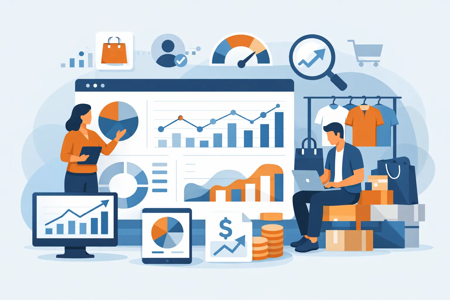
A retail dashboard is only useful if it helps you act faster. The best retail dashboard metrics do exactly that - they show where sales are slipping, where margin is getting squeezed, which stores are falling behind, and what needs attention before small issues turn into expensive ones.
Many retailers already have the data. The problem is that it lives in POS exports, inventory files, department summaries, and promotion reports that are hard to piece together quickly. When metrics are chosen well and presented clearly, operators can stop chasing reports and start managing the business.
What makes a retail metric worth tracking?
Not every number belongs on a dashboard. Good retail metrics have a direct link to decisions. If a metric changes, a manager should know what action to take next, whether that means adjusting pricing, reviewing stock levels, checking staff scheduling, or comparing branch execution.
That is why dashboards should favor operational metrics over vanity metrics. Total sales matters, but on its own it rarely explains performance. A better dashboard shows what is driving the result: transaction volume, basket size, gross margin, inventory health, and the branch or category behind the shift.
The right mix also depends on the business model. A convenience store chain will care deeply about payment mix, fast-moving SKUs, and hourly sales patterns. A pharmacy may focus more on category margins, branch-level stockouts, and repeat customer value. The best retail dashboard metrics are the ones that reflect how your stores actually make money.
11 best retail dashboard metrics for day-to-day retail control
1. Net sales
Net sales is still the starting point because it tells you what the business actually sold after returns, discounts, or adjustments. It gives leaders a clean view of revenue performance by store, department, category, and period.
The key is not to stop there. Net sales becomes much more useful when compared across branches, against prior periods, or alongside promotions. A store can post decent sales while still underperforming due to weak margin or excessive discounting.
2. Sales growth rate
Growth rate adds context to raw revenue. It shows whether sales are moving up or down compared with last week, last month, or the same period last year.
This metric is especially useful for multi-branch retailers because it separates scale from momentum. A large store may still be slowing, while a smaller location may be growing quickly and worth closer attention. Growth rate also helps identify whether a promotional lift was real or whether sales simply shifted from one period to another.
3. Gross margin
Sales without margin can create a false sense of performance. Gross margin shows how much revenue is left after the cost of goods sold, which makes it one of the most important dashboard metrics for protecting profitability.
This is where category and product-level visibility matters. If sales are rising but gross margin is falling, the issue could be discount pressure, bad product mix, supplier cost increases, or heavy selling in low-margin items. Margin should be visible by branch, department, and category, not just at total business level.
4. Average transaction value
Average transaction value, sometimes called average basket value, shows how much each customer transaction is worth. It helps retailers understand whether growth is coming from more customers or from larger baskets.
This metric is useful when paired with promotion analysis and product mix. If transaction value drops, customers may be buying fewer add-on items or shifting to lower-priced products. If it rises, upselling, assortment changes, or pricing adjustments may be working.
5. Transaction count
Transaction count measures customer purchase activity. It is often one of the clearest indicators of store traffic converted into sales.
A drop in sales can come from fewer transactions, smaller baskets, or both. That distinction matters. If transaction count is down but basket value is stable, the problem may be foot traffic, store hours, local competition, or branch execution. If transactions are steady but basket value is weakening, merchandising or pricing may need review.
6. Units per transaction
Units per transaction adds another layer to basket analysis. It shows how many items customers buy in each visit and helps identify cross-sell performance, merchandising strength, and shopper behavior.
For retailers with frequent convenience purchases, this metric can reveal whether customers are making quick single-item trips or broader baskets. A falling units-per-transaction figure may point to missed attachment opportunities even if total transaction value appears stable due to price increases.
7. Inventory turnover
Inventory turnover shows how efficiently stock is moving through the business. It helps retailers avoid tying up cash in slow inventory while keeping high-demand items available.
This metric becomes much more valuable when viewed by category, department, and branch. One store may be overstocked in a category that sells well elsewhere. Another may be selling out too quickly and losing revenue due to poor replenishment. High turnover is not always good if it comes with frequent stockouts, so it should be viewed alongside availability metrics.
8. Stockout rate
Stockout rate highlights products or categories that are unavailable when customers want them. For retailers, this is a direct operational problem because it affects both sales and customer trust.
This metric is easy to underestimate because many teams focus more on what sold than what could not be sold. A dashboard that shows recurring stockouts by branch, SKU, or department gives managers a practical way to improve ordering and allocation decisions. In growing chains, it also helps expose inconsistencies in execution between stores.
9. Sell-through rate
Sell-through rate measures how much of received or available inventory has actually sold in a given period. It is particularly useful for promotion planning, seasonal inventory, and category management.
Low sell-through can signal overbuying, weak product selection, poor pricing, or ineffective display strategy. High sell-through can be positive, but if it happens too quickly it may indicate under-ordering. This is one of those metrics where context matters. The right target depends on the product type, lead time, and replenishment flexibility.
10. Promotion performance
Promotions should be measured as a business result, not just as a sales spike. A good dashboard should show promotional sales uplift, margin impact, units sold, and whether a campaign changed customer behavior in a useful way.
Many promotions increase top-line sales while reducing profitability or shifting demand forward. That is why it helps to compare promoted items against baseline sales and margin. Retailers need to know whether a campaign created incremental value or simply discounted sales that would have happened anyway.
11. Branch performance ranking
For multi-store retailers, branch performance ranking is one of the most practical dashboard views available. It brings together core metrics like sales, growth, gross margin, basket value, and stock issues so operators can quickly see which stores need attention.
Ranking stores only by revenue can be misleading. A better approach looks at a balanced score across multiple metrics. A high-revenue branch with weak growth and margin leakage may deserve more scrutiny than a mid-sized store that is improving steadily. This is where retail dashboards become management tools rather than reporting archives.
How to choose the best retail dashboard metrics for your business
The right dashboard is not the one with the most charts. It is the one that reflects the decisions your team makes every week.
If you oversee store operations, prioritize branch comparisons, hourly sales, transaction trends, and stockouts. If you manage finance, margin, discount impact, and category contribution will matter more. If you are responsible for growth, customer value, promotion effectiveness, and product performance should be easier to see.
There is also a maturity question. Some retailers need a dashboard that answers foundational questions first: Which branches are underperforming? Which categories are dragging margin? Which products are repeatedly out of stock? Others are ready for more advanced analysis such as customer segmentation or promotion lift by store cluster.
The practical rule is simple: start with metrics tied to immediate action. Once those are trusted and used consistently, expand from there.
Why these metrics work better in a retail-specific dashboard
Retailers often struggle not because they lack data, but because their reporting is too fragmented. Sales sits in one file, inventory in another, and promotions somewhere else. That slows down decision-making and creates too much manual work for teams that already have stores to run.
A retail-specific dashboard solves this by organizing exported POS and operational data into views that match how retail businesses operate. Instead of building reports from scratch, teams can review store performance, product trends, customer summaries, payment mix, and campaign results in one place. Platforms like BusinessMetrics AI are built around this workflow, which makes the metrics more usable for operators who need answers quickly rather than custom BI development.
That usability matters. A metric only drives results if people can find it, trust it, and understand what to do next.
The real goal is faster action
The best retail dashboard metrics are not just indicators for leadership meetings. They are early warning signals for the people running the business every day. When net sales softens, margin narrows, stockouts rise, or one branch starts falling behind, the dashboard should make that obvious without forcing anyone to stitch together spreadsheets.
If your dashboard helps you spot what changed, where it changed, and what likely caused it, it is doing its job. That is usually the difference between reporting on the business and actually managing it.