
A regional operator reviews yesterday's sales, but the real question is not whether revenue was up. It is why one store missed margin, why card fees jumped, and why a promotion lifted units without lifting profit. A POS analytics dashboard should answer those questions fast, without forcing someone to build pivot tables before the day starts.
For retailers running multiple stores, fast answers matter more than more reports. Most teams already have POS data. The gap is visibility. Sales, products, payments, departments, hourly trends, and promotions often sit in separate exports, and someone has to piece them together manually. That slows response time and makes it harder to spot store-level issues before they become month-end surprises.
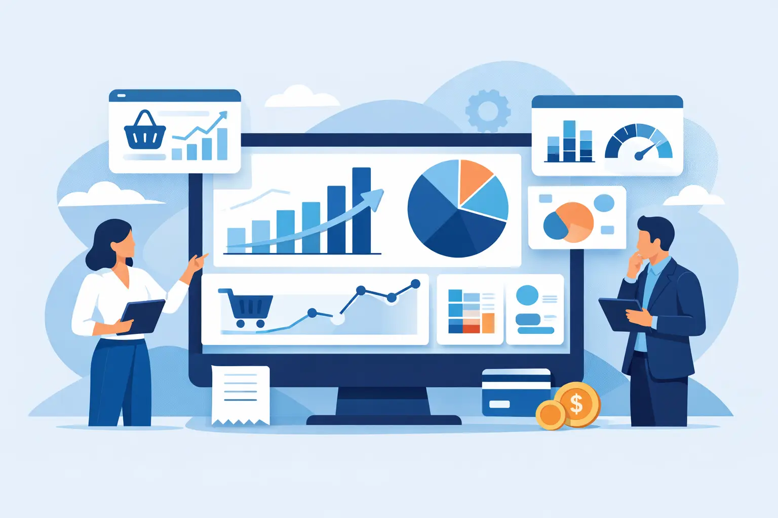
Why a POS analytics dashboard matters in day-to-day retail
Retail operations are full of small shifts that affect performance. A branch can post strong top-line sales while losing margin through discounting. A category can look healthy until you compare unit movement to stock pressure. Payment mix can change in ways that raise fees without anyone noticing. When reporting is manual, those patterns are easy to miss.
A useful dashboard reduces the distance between exported data and action. It gives owners, operators, and finance leads a clear view of what changed, where it changed, and what likely needs attention. That is especially important for grocery, pharmacy, convenience, and general retail chains where volume is high, margins are tight, and branch managers need practical direction rather than abstract analytics.
The value is not just speed. It is consistency. When every branch is measured through the same definitions and views, performance discussions improve. Teams stop debating which spreadsheet is correct and start focusing on what to fix.
What a POS analytics dashboard should actually include
The best dashboards are not the ones with the most charts. They are the ones that answer recurring business questions in a few clicks. For most POS-driven retailers, that starts with branch performance.
Branch performance by store
Every multi-store retailer needs a clean way to compare locations. Sales alone are not enough. A branch view should show revenue, transactions, average basket, units per transaction, gross margin where available, discount impact, and growth versus prior periods. It should also make it easy to rank stores and isolate outliers.
This matters because branch problems rarely show up in one metric. A store with stable sales but declining basket size may have a conversion or merchandising issue. A branch with strong transactions but weak margin may be leaning too hard on promotions. The dashboard should help operators see those relationships quickly.
Product and category performance
Retailers need to know which SKUs and categories are driving sales, margin, and volume, and which ones are tying up space without enough return. A strong product view should surface top and bottom performers, growth trends, mix changes, and sell-through patterns.
This is where many generic BI tools fall short. They can display product data, but they do not always organize it in a way that reflects retail decisions. Operators need to compare products across stores, departments, and time periods without building custom logic every time. If a category is up in one branch and down in another, that should be obvious.
Customer and basket behavior
If customer summary data is available, the dashboard should help answer practical questions about repeat behavior, basket value, and customer contribution. Which stores have the highest average spend? Are more transactions coming from low-value baskets? Are top customers concentrated in a few locations?
Not every retailer has deep customer-level data, and that is fine. A good system should still make the most of what is available rather than requiring a full loyalty stack. The point is to move from raw transaction totals to buying behavior that can guide pricing, assortment, and promotional decisions.
Payment mix and transaction trends
Payment mix often gets less attention than sales, but it affects profitability and store operations. Cash, debit, credit, EBT, and other tender types can shift by branch or time period. Those shifts can raise fees, affect reconciliation workloads, or signal changes in customer behavior.
A POS analytics dashboard should make payment trends visible alongside transaction count and basket size. If card usage rises sharply while average ticket falls, the cost implications are different than if higher-value baskets are moving to card. That context helps finance and operations teams respond with better precision.
Hourly sales and trading patterns
Hourly data is operational gold when it is presented clearly. It helps managers understand peak trading windows, labor alignment, promotion timing, and lost opportunity. If one store peaks earlier than another, staffing and replenishment decisions should reflect that.
The dashboard should allow users to compare hourly sales across branches and days, not just view a single store in isolation. That is how patterns become useful. Otherwise, hourly charts become interesting but not actionable.
Promotion results and margin impact
Promotions should be measured beyond revenue lift. Retailers need to know whether a campaign increased units, improved basket size, shifted category mix, or simply reduced margin. A dashboard should connect promotional periods with product and branch outcomes so teams can judge effectiveness without manual report stitching.
There is a trade-off here. Promotion analysis can become messy if source data is inconsistent or if discount logic varies by store. That is why data validation matters. If the underlying files are not structured clearly, the dashboard may still show movement but not enough reliable detail to explain why it happened.
The difference between a useful dashboard and a busy one
Many reporting tools create visual clutter. They show everything the dataset can support, not everything the business needs. That usually leads to slow adoption. Managers open the dashboard once, feel overloaded, and go back to spreadsheets.
A useful POS analytics dashboard is narrower and more deliberate. It starts from the recurring questions retail teams ask every week. Which branches are underperforming? Which products need attention? Where is margin slipping? What changed in payment mix? Which promotion worked, and where?
That focus matters because retail teams do not need more data exposure. They need shorter paths to decisions. A dashboard earns trust when it helps someone identify a problem in minutes and explain it clearly in a meeting.
Why self-service matters more than custom BI for many retailers
Custom business intelligence has its place, especially in large enterprise environments with dedicated analysts. But many growing chains do not need a long implementation cycle or a flexible system that requires technical setup for every new question. They need something they can start using now with the exported files they already have.
That is where self-service retail analytics is more practical. If a platform can validate uploaded CSV or XLSX files, map them into retail-specific models, and generate ready-to-use dashboards, the time to value drops sharply. Teams spend less time preparing data and more time reviewing performance.
It also changes who can use analytics. Instead of routing every question through finance or an analyst, store and commercial teams can get answers directly. That improves operating speed, especially across multi-branch businesses where response time affects stock decisions, labor planning, and promotional follow-up.
Where AI fits inside a POS analytics dashboard
AI is useful when it reduces reporting friction, not when it adds another layer to interpret. In this context, the practical use case is natural-language querying. A manager should be able to ask which branch had the weakest margin trend last week, which category underperformed in a specific store, or which products gained sales during a promotion but lost profitability.
That approach works best when it sits on top of structured retail dashboards rather than replacing them. The dashboard provides the operating view. AI helps users ask follow-up questions without building new reports. For non-technical users, that can be the difference between seeing a pattern and understanding it.
BusinessMetrics AI is built around that model - retail data uploads, prebuilt dashboards, and natural-language answers in one workflow. For operators who already export POS and operational data, that setup is easier to adopt than generic analytics tools designed for broader BI teams.
What to look for before choosing one
If you are evaluating a POS analytics dashboard, start with fit rather than feature count. Can it handle the exports your POS already produces? Does it show branch, product, customer, inventory, hourly, and promotion data in a way that matches how your teams run the business? Can non-technical users answer follow-up questions without waiting on someone else?
Also look closely at onboarding. The dashboard can only be as reliable as the data structure behind it. File validation, consistent mapping, and retail-specific definitions are not nice extras. They are what make the reporting usable.
A final test is simple. After looking at the dashboard for five minutes, can a branch manager, finance lead, and owner all point to the same priority? If the answer is yes, the dashboard is doing its job. If not, it is probably showing data without delivering enough clarity.
The best retail reporting tools do not try to impress with complexity. They help teams see what changed, decide what matters, and act before the next trading day makes the problem bigger.